I worked on projects that grew the PicsArt creative community from 65 million users to over 100 million today. As the first and most senior designer reporting to the UX director in the SF office, I helped scale the UX team to 30, evangelizing the latest prototyping, research and design tools along the way.
User Ratings: 4.1 stars (App Store) • 4.5 (Google Play)
CASE STUDY: EVOLVING THE #FREETOEDIT FEED
Team: Feeds Business Unit
Role: Design lead working with a junior designer, lead and associate PMs, and remote developers
Time frame: Late 2016 – Mid 2017
Before I started at PicsArt, its signature community feature was images posted with the hashtag #FreeToEdit, indicating that other users could take these and remix them in infinite ways using the powerful in-app editor. One of the first major projects we tackled was making user-generated open source images an official system-supported feature.
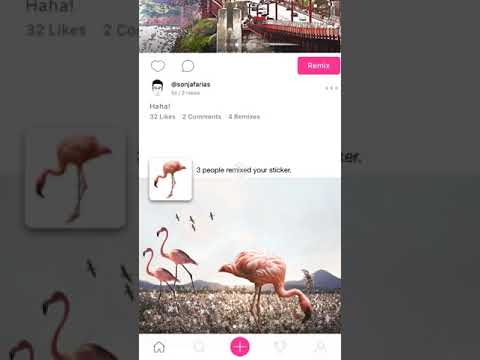
To do this, we added a toggle into the image upload flow and established Remix as the primary call-to-action on posts beyond the Like/Comment actions typical of social networks.
Users saw a count of how many remixes an image had, and once in image view, they could navigate to a gallery of remixes, source images and algorithmically generated similar images.
We realized that while putting related images in their own gallery was a clean initial solution, we weren't getting users to browse or create remixes as much as we wanted them to, considering remixing was the core metric we began using to measure the health of our community.
The problem was twofold: only 1% of users tapped on the Remix button after seeing an image, and only 6% of image viewers navigated to see remixes, sources and similar images.
Why were so few users tapping on Remix and only a few more browsing related images in the first place?
After spending some time digging into and understanding the problem, we assessed the biggest factor as friction: viewing remixes from an original was always one tap/screen away, and making a remix took multiple steps of varying amount.
Reducing the friction to browse and create remixes from an original would encourage users to make more remixes.We conducted several rounds of design sprints to collaboratively design concepts around this hypothesis, which resulted in many prototype variations and user studies before we arrived at the solution to be implemented.
Going from low fidelity...
To mid fidelity mockup concepts...
To interactive high fidelity prototypes...
We put our concepts in front of users, both online and offline...
Design Goals
- Familiarize users with the concept of remixing
- Encourage users to remix images
- Decrease the number of steps to see multiple remixes
Research Goals
- Do users understand the concept of Remixing? What do they think of it?
- Do users conceptually understand the difference between remixing a friend's original image and seeing a remix that a friend made from someone else's original?
After a few months of iterations, we moved forward with a refined version of the option that presented less development effort, as a modular addition to the existing post format.
We understood that in the long term, if we wanted to increase user delight, we had a well-tested, more complex version that would differentiate the product further to increase remixing.